CSS is amazing(Human err).
If it doesn’t work, you know that it is confused and won’t give an error. This confusion could have been solved by giving error/warning but CSS choose not too. That’s why all this hate for CSS on internet.
Let’s come to drawing a horizontal tree with a root in center, because WHY not. The tree structure should be like
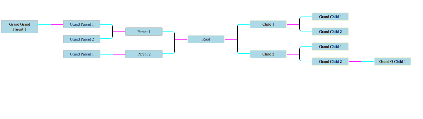
A node can have multiple children, in simple terms and each tree will be centered around root. Don’t bother about responsive-ness for now, it will require some javascript and SVG which we aren’t going to do for now.
Concept(s) needed
CSS pseudo elements
What is a pseudo element?
You might have used pseudo classes abundantly, pseudo elements are similar to pseudo classes but they are used to style specific part of the selected item. For eg. :before/::before, :after/::after, :placeholder, :grammar-error etc.
That’s it, all we need is pseudo elements(as the heading states) to make the branches out of the nodes, either horizontal or vertical. Also knowledge of relative positioning and absolute positioning will come handy.
We will make this tree in parts, right part has root included itself. First lets draw the tree in crude way.
Tree skeleton
The tree skeleton is like something below:
1
2
3
4
5
6
7
8
9
10
11
12
13
14
15
16
17
18
19
20
21
22
23
24
25
26
27
28
29
30
31
32
33
34
35
36
37
38
39
40
41
42
43
44
45
    <body>
        <div id="wrapper">
          <div id="root-left">
              <div class="branch-inverse l1">
                <div class="entry-inverse">
                  <div class="branch-inverse l2">
                    <div class="entry-inverse">
                      <div class="branch-inverse l3">
                        <div class="entry-inverse sole"></div>
                      </div>
                    </div>
                    <div class="entry-inverse"></div>
                  </div>
                </div>
                <div class="entry-inverse">
                  <div class="branch-inverse l2">
                    <div class="entry-inverse sole"></div>
                  </div>
                </div>
              </div>
          </div>
          <div id="main-root"><span class="label">Root</span></div>
          <div id="root-right">
            <!-- <span class="label">Root</span> -->
              <div class="branch l1">
                <div class="entry">
                  <div class="branch l2">
                    <div class="entry"></div>
                    <div class="entry"></div>
                  </div>
                </div>
                <div class="entry">
                  <div class="branch l2">
                    <div class="entry"></div>
                    <div class="entry">
                      <div class="branch l3">
                        <div class="entry sole"></div>
                      </div>
                    </div>
                  </div>
                </div>
              </div>
            </div>
        </div>
    </body>
which will look like

So we have branches, which have entry and entry can other branches and entries as its child(ren). Let’s first understand how CSS will be applied, CSS will be applied from inner most tag to other most tag, so the height of branches will add up and each branch’s height will be cumulative from previous height.
We have fixed the node’s width to 150 px here also incoming connection and outgoing connection are 50 px each, therefore a branch will be 250 px wide.
Let’s come to drawing connections, we have entry as node which is our reference for connections, we will create incoming connection on the right tree using :after pseudo element. For branch’s height we will use :before pseudo element on entry element. It’s possible to swap :before and :after but need to some alignment.
Branch has the outgoing connection.
1
2
3
4
5
6
7
8
9
10
11
12
13
14
15
16
17
18
19
20
21
22
23
24
25
26
27
28
    .entry:before {
      content: "";
      height: 100%;
      position: absolute;
      border-left: 2px solid black;
      width: 50px;
      left: -50px;
    }

    .entry:after {
      content: "";
      width: 50px;
      border-top: 2px solid aqua;
      position: absolute;
      left: -50px;
      top: 50%;
      margin-top: 1px;
    }

    .branch:before {
  content: "";
  width: 50px;
  border-top: 2px solid magenta;
  position: absolute;
  left: -100px;
  top: 50%;
  margin-top: 1px;
}
Think pseudo elements as box and then choose their side, that’s what we have done, for incoming connection we chose border-top, for branch height we chose border-left. See the image how boxes looks like.
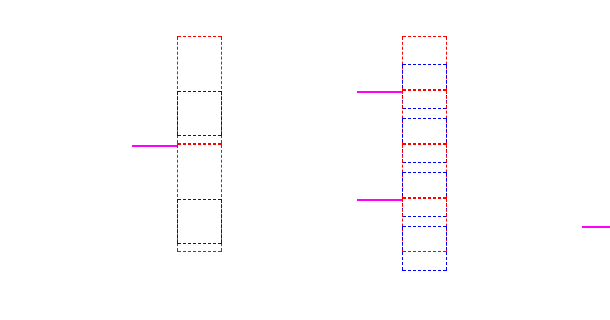
Notice how positioning is done using top and left.
Tree skeleton demo is here..
Nodes on the tree
Now we can add label on the right and tree will look Neat like this.
Label will be like this:
1
2
3
4
5
6
7
8
9
10
11
12
13
14
15
    .label {
      display: block;
      min-width: 150px;
      padding: 5px 10px;
      line-height: 20px;
      text-align: center;
      border: 2px solid silver;
      border-radius: 5px;
      position: absolute;
      left: 0;
      top: 50%;
      margin-top: -15px;
      overflow-wrap: break-word;
      background-color: lightblue;
    }
Notice the top and margin-top to make this label centered in the div using position absolute.
Whew, that’s all.
The left sub tree is easy and left as an exercise to the reader.(Just kidding.)
Left sub tree
For the left part construct the tree same as right tree but some CSS needs to be reversed. The quickest way to understand this is see the diff of two tree’s CSS
1
2
3
4
5
6
7
8
9
10
11
12
13
14
15
16
17
18
19
20
21
22
23
24
25
26
27
28
29
30
31
32
33
34
35
36
37
38
39
40
41
42
43
44
45
46
47
48
49
50
51
52
53
54
55
56
57
    -.branch {
    +.branch-inverse {
       position: relative;
    -  margin-left: 250px;
    +  margin-right: 250px;
     }

    -
    -.branch:before {
    +.branch-inverse:before {
       content: "";
       width: 50px;
       border-top: 2px solid magenta;
       position: absolute;
    -  left: -100px;
    +  right: -100px;
       top: 50%;
       margin-top: 1px;
     }

    -.entry:before {
    +.entry-inverse:before {
       content: "";
       height: 100%;
    +  border-right: 2px solid black;
       position: absolute;
    -  border-left: 2px solid black;
    -  left: -50px;
    +  right: -50px;
     }

    -.entry:after {
    +.entry-inverse:after {
       content: "";
       width: 50px;
       border-top: 2px solid aqua;
       position: absolute;
    -  left: -50px;
    +  right: -50px;
       top: 50%;
       margin-top: 1px;
     }

    -.label {
    +.label-inverse {
       display: block;
       min-width: 150px;
       padding: 5px 10px;
    @@ -48,7 +46,7 @@
       border: 2px solid silver;
       border-radius: 5px;
       position: absolute;
    -  left: 0;
    +  right: 0;
       top: 50%;
       margin-top: -15px;
       overflow-wrap: break-word;
Now if you notice branch is place with margin of 250 px from right in its position, the magenta color connection is placed at 100 px to right from nodes which is opposite of what is on right side tree. .entry-inverse is now positioned with respect to right and .label-inverse is also position with respect to right.
CSS polishing
Now comes the task of providing finish to the product, we want round curves instead of bland straight lines in the tree. It’s important to note on :first-child and :last-child need to have rounded corners. Like the pic given below.

Demo code is present here..
For this we have provided round border to straight line and incoming connection to the node for their :first-child and :last-child with :before and :after property individually. Also we will truncate the height to 50% and position it 50% from top.
1
2
3
4
5
6
7
8
9
10
11
12
13
14
15
16
17
18
19
20
21
22
23
24
25
26
27
28
29
30
31
.entry-inverse:first-child:before {
  width: 10px;
  height: 50%;
  top: 50%;
  margin-top: 2px;
  border: 1px dashed red;
  border-radius: 0 10px 0 0;
}


.entry-inverse:first-child:after {
  height: 10px;
  border-radius: 0 10px 0 0;
  border: 1px dashed blue;
}

.entry-inverse:last-child:before {
  width: 10px;
  height: 50%;
  border-radius: 0 0 10px 0;
  border: 1px dashed violet;
}

.entry-inverse:last-child:after {
  height: 10px;
  border-top: none;
  border-bottom: 2px solid black;
  border-radius: 0 0 10px 0;
  margin-top: -10px;
  border: 1px dashed orange;
}
If now you remove the dashed lines, you will get the straight lines except for the sole children, for that we don’t want round corner and not want to display straight line. So the below CSS will help that.
1
2
3
4
5
6
7
8
9
10
.entry-inverse.sole:after {
  width: 50px;
  height: 0px;
  margin-top: 1px;
  border-radius: 0px
}

.entry-inverse.sole:before {
  display: none;
}
Right side rounded corners
Similarly the right side tree rounded corners can be handled. See the diff below for instant salvation.
1
2
3
4
5
6
7
8
9
10
11
12
13
14
15
16
17
18
19
20
21
22
23
24
25
26
27
28
29
30
31
32
33
34
35
36
37
38
39
40
41
42
43
44
45
46
47
48
49
50
51
52
53
54
55
56
57
--- .entry-inverse:first-child:before { (Selection)
+++ (clipboard)
@@ -1,42 +1,43 @@
-.entry-inverse:first-child:before {
+.entry:first-child:before {
   width: 10px;
   height: 50%;
   top: 50%;
   margin-top: 2px;
   border: 1px dashed red;
-  border-radius: 0 10px 0 0;
+  border-radius: 10px 0 0 0;
 }


-.entry-inverse:first-child:after {
+.entry:first-child:after {
   height: 10px;
-  border-radius: 0 10px 0 0;
+  border-radius: 10px 0 0 0;
   border: 1px dashed blue;
 }

-.entry-inverse:last-child:before {
+.entry:last-child:before {
   width: 10px;
   height: 50%;
-  border-radius: 0 0 10px 0;
+  border-radius: 0 0 0 10px;
   border: 1px dashed violet;
 }

-.entry-inverse:last-child:after {
+.entry:last-child:after {
   height: 10px;
   border-top: none;
   border-bottom: 2px solid black;
-  border-radius: 0 0 10px 0;
+  border-radius: 0 0 0 10px;
   margin-top: -10px;
   border: 1px dashed orange;
 }

-.entry-inverse.sole:after {
+.entry.sole:after {
   width: 50px;
   height: 0px;
   margin-top: 1px;
   border-radius: 0px
 }

-.entry-inverse.sole:before {
+.entry.sole:before {
   display: none;
-}
+}
+
As you can see only border radius has been changed.
Conclusion
That’s concludes our tree and sweet CSS lesson. Neat polished demo is here.
Remember you need patience with CSS else just go for SCSS/Sass. :)
And Of course it was there on the web but only the half part. Till next time.